Blunt pencils and bright colours
It’s been a busy month for running art courses and there are more to come. Next week I’ll be leading a painting holiday in the lovely Scilly Isles organised by Art Safari – I do love islands and the Scillies are a favourite. Closer to home I’ve done a few workshops and demonstrations, and having promised an enthusiastic group of artists at U3A in Martlesham a summary of my colour choices, I thought I’d make a blog post of some of the things we did and some of my more unusual bits of advice. Hopefully it might be useful for others too!
1. Stop trying to paint pictures
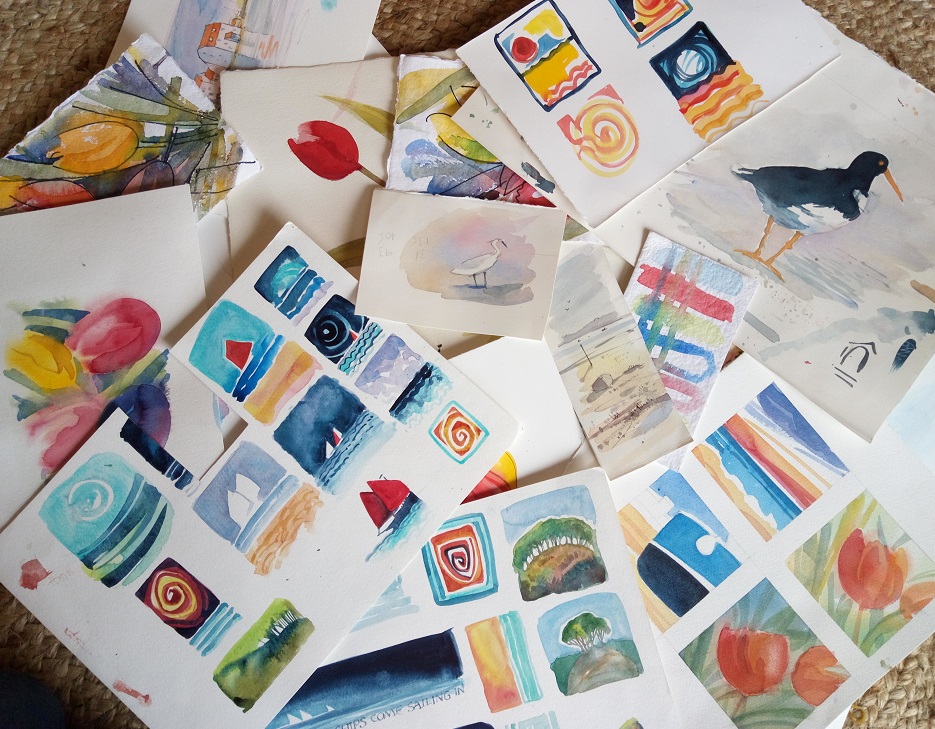
If you’re bored with the way your paintings are turning out, if they all come out the same and you keep making the same mistakes, stop for a while. Ban yourself from producing a painting for, say, a month. Spend all that time with a sketchbook instead, or cut your sheets of watercolour paper into smaller pieces and play with colours, patterns and shapes. Doodle, mix colours, fill the page. Draw and paint bits and pieces, or the objects around you. Then, when you go back to trying to paint a ‘proper’ picture, you will have new skills to bring to it.
2. Use tracing paper
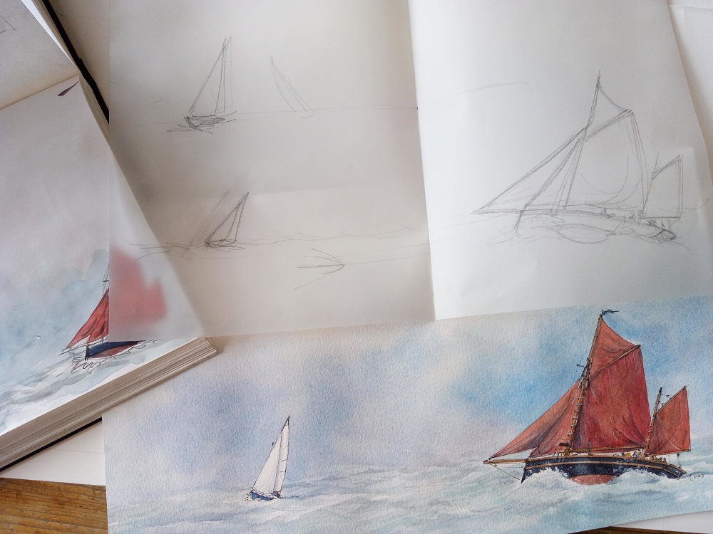
What – isn’t that cheating? No. I use tracing paper to avoid damaging good watercolour paper by constant rubbing out. For a complex drawing I do a small rough sketch first to work out the composition. Then I start the pencil work on tracing paper the same size as my watercolour paper. I can safely make mistakes, rub out, redraw, change the composition, move elements around, get relative sizes right, and keep my final paper pristine. When I’m happy with the drawing I transfer it onto watercolour paper, using a light box. (If you don’t have a light box you can use the traditional way of drawing on the reverse and then overdrawing again so that it transfers).
Of course if you’re trying to draw an unfamiliar object, or a familiar one from a new viewpoint, and it keeps going wrong, you can trace direct from a photo or computer screen just to get the main shapes right. It’s not cheating, it’s using the tools at your disposal. (But don’t use tracing as a substitute for learning to draw or your paintings will never come alive.)
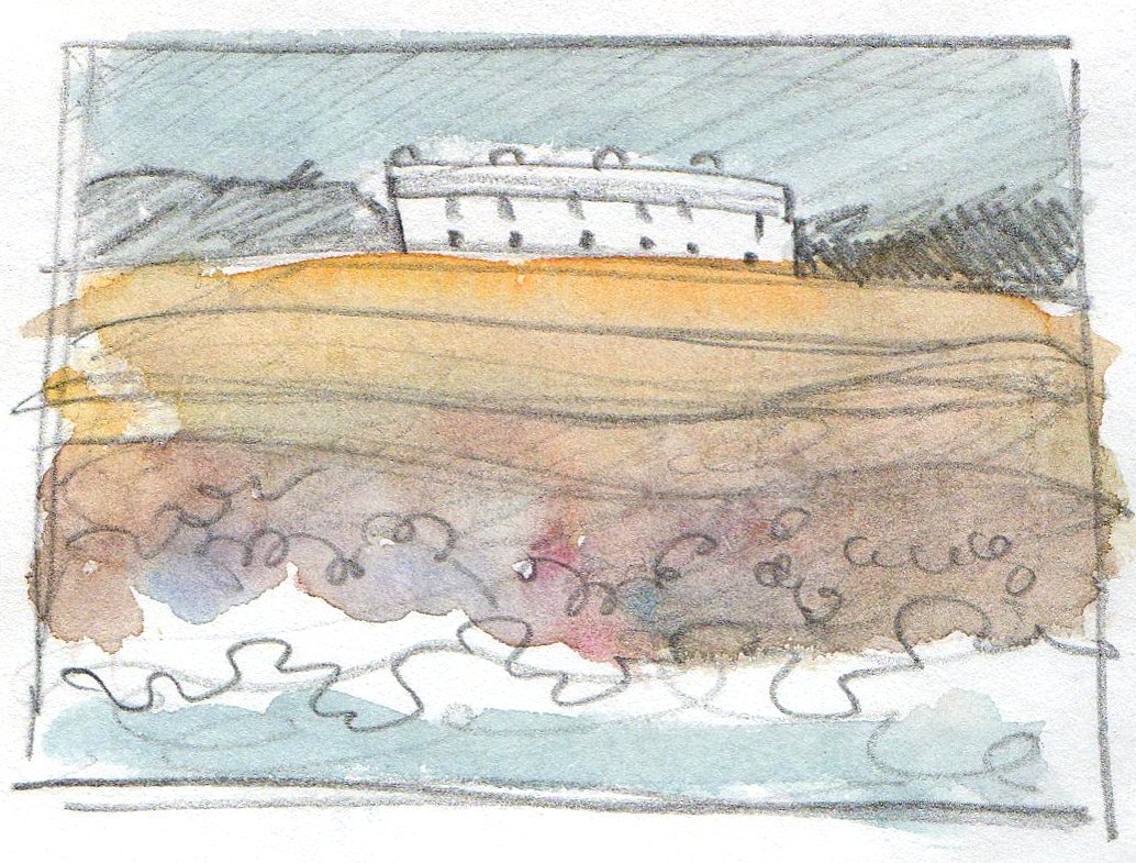
3. Use photos wisely
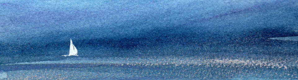
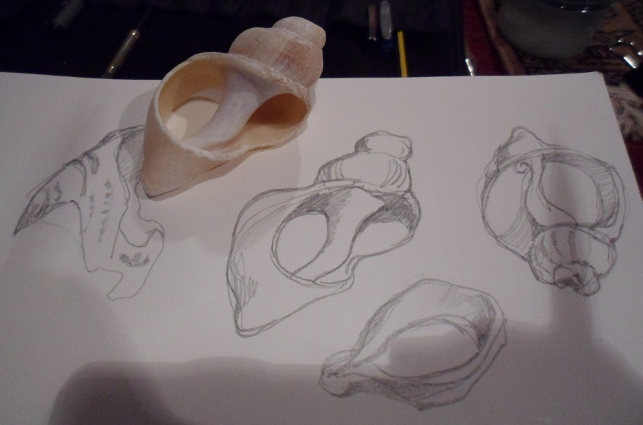
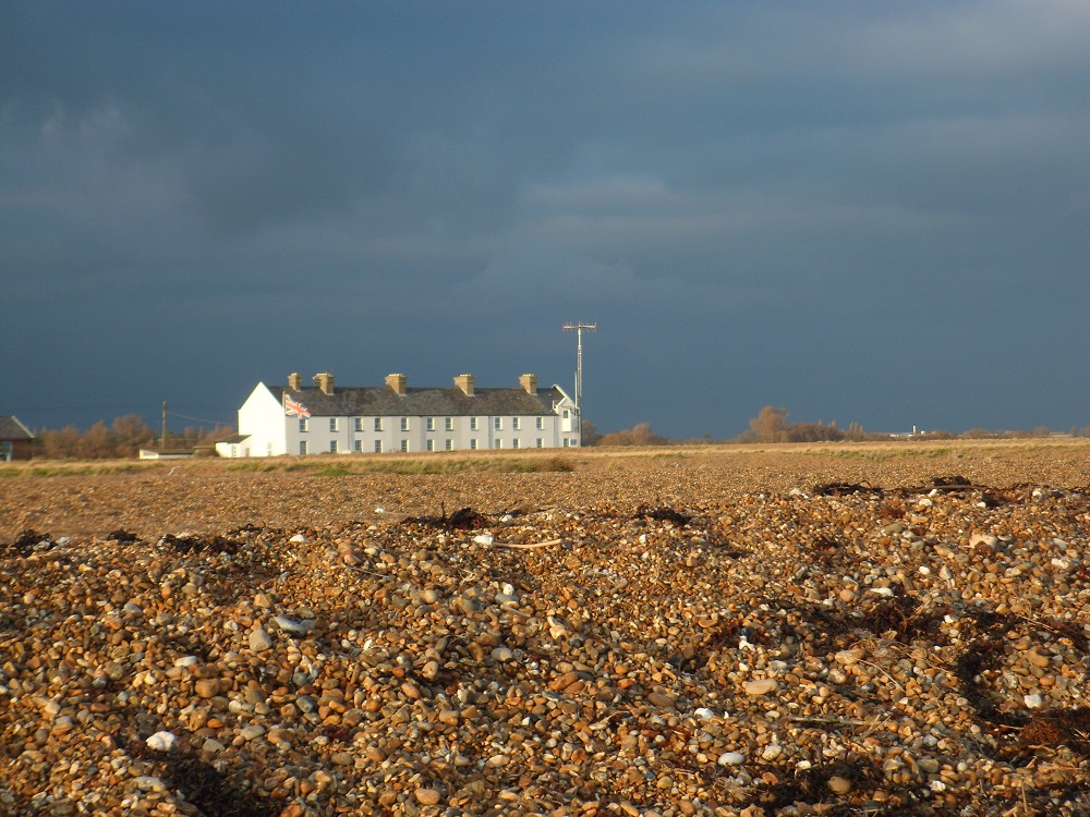
It’s quick and easy to take a photo of a subject and then get your paints out back at home or the art club. But it’s so easy that it can make you lazy. A photo is already the same shape as your paper so you forget to compose the scene to best advantage. You forget to study it in detail, notice the light and how shapes change at different viewpoints. Always sketch from life as well, even if it’s a few lines. Bring something back from the scene (pebbles, shells, leaves, colour notes, written notes) to keep that connection going. Use the photo as an aid to memory, not a substitute.
4. Think about why you draw and paint
I draw to help me to understand and appreciate my world. You’ll find that you think you know what something looks like, but really you don’t look at anything properly until you try and draw it. Even if the drawings are not technically very good, this still works!
‘I believe that the sight is a more important thing than the drawing; and I would rather teach drawing that my pupils may learn to love Nature, than teach the looking at Nature that they may learn to draw’. (Ruskin, Elements of Drawing)
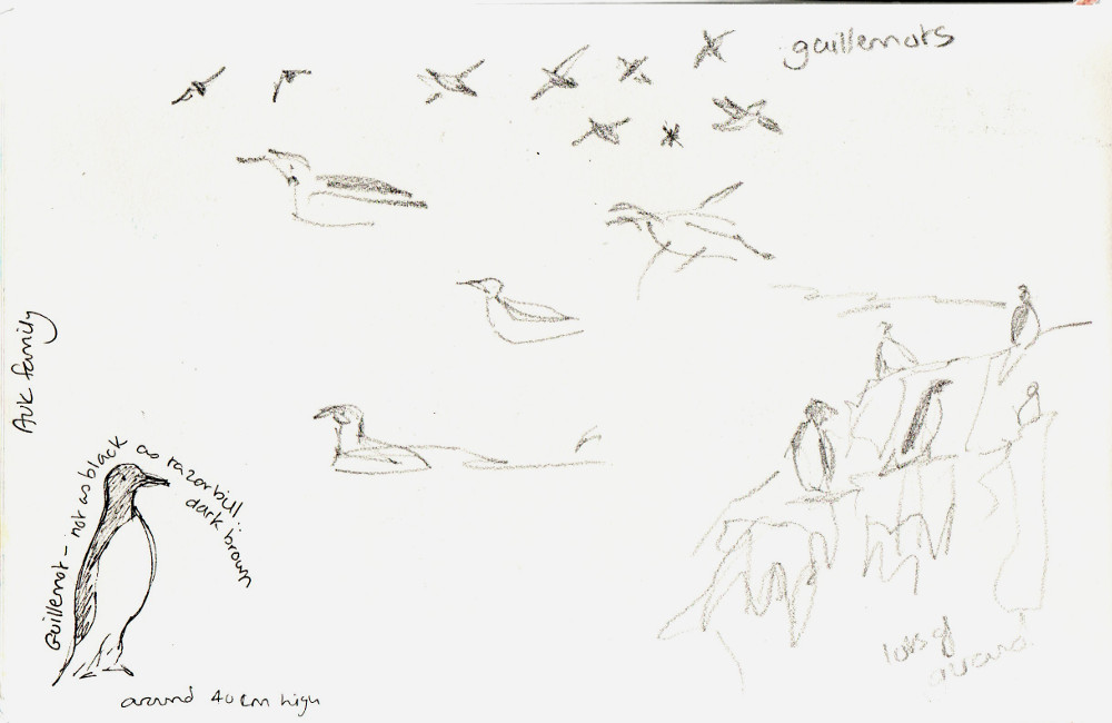
My sketchbook drawings are a mix of about 80% drawings done on location, 20% done back home from memory, checking my photos and even looking on google for more knowledge of how things look close up, especially birds and animals sketched on the move.
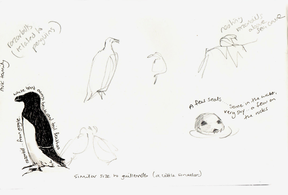
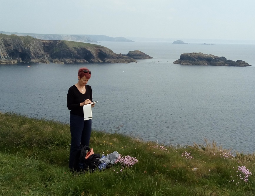
These pages were from a trip to Ramsay Island off Pembrokeshire on a fast RIB. The sketches are of course very scribbly and I couldn’t see in detail the difference between the razorbills and the guillemots. So I googled them when I came home to find out more. Draw first, research afterwards.
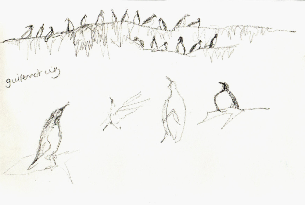
I draw for a living; if I don’t draw then I don’t eat. But… I still draw for pleasure too. I wouldn’t have appreciated that boat trip half as much without my sketchbook!
5. Get to know your colours
Think about the people close to you. You know their names, what they are like, which ones get along together and which ones don’t. If you’re having a party, you don’t pick names at random from your contact list. Colours are the same. They have characters, ways of behaving and mixing; you need to get to know them, spend time. Invite two to dinner and see how they get on. Know their names so you can invite them again when you want to!
You’ll learn that cobalt blue and ultramarine are well mannered and good mixers; they get on well with alizarin crimson and produce beautiful purples and mauves. You’ll learn that cadmium red dances on the tables at parties and is very loud, producing a deep bruise black when mixed with that flamboyant blue, winsor blue green shade.
Maybe it’s just me who sees colours as characters because the inside of my head is a very strange place! But however you do it, you need to know those primaries and what they do. Spend time with them. Everyone has their favourites but these are my pigment friends:
cobalt blue, winsor blue (green shade), ultramarine, indigo, cerulean blue
alizarin crimson, cadmium red,
raw sienna, cadmium yellow, aureolin
Occasionally I’ll use a non-primary like burnt sienna (to mix with ultramarine). I’ve never found the need for pre-mixed greens.
Get into the habit of mixing colours on the paper rather than in the palette. You’ll get much more dappled and interesting mixes than you will if you stir them to mud in the palette.
(I do have people as friends too, honest!)
6. Stop using colours for a while.
Having said all that about colours, they need putting to one side from time to time so that you can remind yourself about the importance of light and shade, or tone. This is how artists pull off the trick of making things look 3 dimensional on a 2 dimensional page. You don’t see this shape as a flat round thing with a grey bit, you translate it as a solid object; it’s how our brains read images. Plenty of pencil work will make you concentrate on the language of tone and the fall of light that produces that trickery.
If your paintings look flat, print out a black and white version of them. Do a tonal sketch of the same scene in soft pencil to discover where your lights and darks should be.
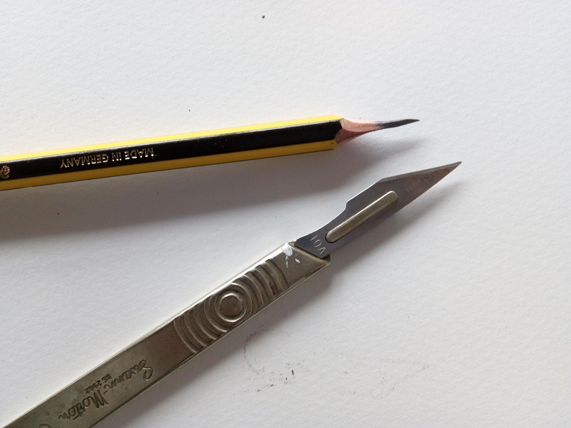
7. Keep your pencils sharp
It sounds obvious, but many people don’t, and you can’t create anything with blunt tools. A craft knife or quality pencil sharpener will do the job, and there are even dozens of youtube tutorials online on the subject of how to keep pencils and coloured pencils sharp.
8. Appraise your work with curiosity not criticism.
If you don’t like what you produce, don’t condemn yourself as hopeless and untalented. All technical mistakes can be resolved with understanding and a bit of effort. Try to look calmly at what’s worked in your painting and what hasn’t. Once you’ve named the problem (for example, too flat, wobbly drawing, scratchy washes, dull colours) you can look for solutions. Ask for help, work with honest but encouraging friends. Every skill worth having requires oodles of practice, but that’s life. There is no destination, only the journey.
Oh how very, very pertinent and inciteful.
Thank you.
Bookmarked.
You’re work is wonderful. I wish I live there so I could take your classes!
There’s a lot of experince in those few lines.
Great advise, thanks!
Are non painting partners welcome at your workshops on the Scilly Isles ?
Inspired by your article in Leisure Painter, especially as I am having problems getting going again after the death of my wife.