Keep off the mud
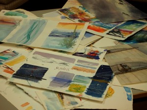
Sound advice for both east coast sailors and watercolour artists, ‘Keep off the mud’ was the title of a talk I did at Woodbridge Art Club earlier this week. It seems to be my year for burbling at an unsuspecting audience. This time the subject was colour mixing, and I know I’ve covered it before in a previous blog post, but not for a while, so here come the basics again. All non-arty friends can switch off now, I’m on a roll…
1. If you find choice of colours confusing:
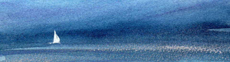
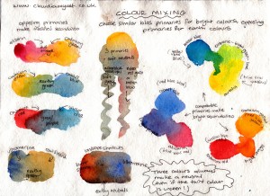
Keep your mixes simple to start with; if you use only three or four colours, you are less likely to end up with sludge. This is especially true of landscape painting, where a limited palette gives unity of mood and light. Botanical and still life painters are more likely to need a wide range of colours. A typical landscape artist’s set of primaries might be raw sienna, alizarin crimson, cobalt blue, with a touch of indigo for mixing deep darks.
Tone is more important than colour; try doing a monochrome painting using only burnt sienna and ultramarine. If your full colour painting looks a bit flat, make a black and white photocopy of it; if it looks all the same, you have been too distracted by colours and not worked enough on tone.
2. If your colours turn muddy:
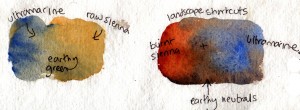
Don’t mix more than three colours (two if a colour is already a composite like brown or green). If you mix three colours and they look brown, add more blue.
Three primaries together make lovely rich neutral shades, even the brightest primaries. Magic! You can also mix good earth colours by using burnt sienna and cobalt or ultramarine (which works for the same reason – three colours in two tubes..)
3. If your mixed colours look a bit boring and flat:
You’re probably over-mixing in the palette. Don’t mix your paints to a uniform colour, let them blend on the paper. Mix wet on wet on the page for plenty of variety and interest. Add more transparent layers wet on dry, only partly covering what went before; the new colour will mix and be modified by the colours underneath. Think of layers of coloured tissue paper.
There’s beauty in the colours of rock and earth if you remember that they consist of all the colours, and it’s the quality of the light that determines which you see.
4. If you have trouble with greys, blacks and browns…
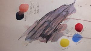
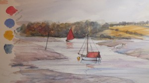
Mixed darks are much more lively than grey or black out of a tube. For a vibrant deep dark try winsor blue mixed with cadmium red – lovely – I’ve used this in the rock pic above. Never use paynes grey for shadows – shadows have colour and transparency. For a dark, woody green try indigo (or paynes grey – horrible on its own – mixed with aureolin).
5. If you find landscape colours tricky….
 Landscapes often consist of greens and browns which look great in real life but tend to make an unappealing sludgy picture. You need to vary the colours as much as possible.
Greens are particularly tricky. There are so many of them in nature that we are sensitive to all their variety, and that variety needs to be reflected on the page as far as possible. You don’t need green out of a tube, but if you do use them, modify them with your own mixes of yellows and blues. I put yellows and blues on the paper in fairly random patches to make a patch of green foliage, throwing in a bit of red for good measure.
Earth colours – mud, rocks, tree trunks – are never uniform or dull. Look carefully and you will see blues, yellows, reds and and a hundred others in there too. Exaggerate these colours on the page so that others see them too.
6. If you find that blue and yellow don’t always make green….
Not all primary colours are the same. Cobalt is biased towards red; winsor blue is biased towards yellow. Paint a patch of them side by side and you’ll see it. To get bright secondaries, you need compatible primaries – winsor blue is already leaning towards yellow, aureolin is already leaning towards blue, so together they make vibrant green. If one of your primaries has a different bias, that unseen colour will affect the mix and neutralise it. Try making purple out of winsor blue and cadmium red and you’ll see what I mean.
I hope all that makes some kind of sense. I learnt to draw by scrumping information I liked from a wide variety of artists, many of whom disagreed with each other’s methods. The only rule in painting is that all the rules can be broken! And if in doubt, add more wine….
Really useful advice, Claudia. Thanks. I think you may have picked up some extra tips from all my mistakes a few weeks ago!
Frances
プレイボーイ ポロ